Apply CellCap to human monocytes data
In this tutorial, we will demonstrate the interpretability of CellCap with pathogen-exposed human monocytes. In the original report, Oelen et al. identified differentially expressed (DE) genes by comparing each treatment condition against untreated control for every major cell type. They observed the most DE genes in monocytes across different pathogen exposure conditions and concluded that monocytes are the cell type with the strongest response to pathogens. However, such analysis underrates the advantage of single-cell data for revealing heterogeneous responses to pathogen exposure and also fails to uncover a complex relationship across different treatments. We will reexamine the pathogen-exposed monocytes with CellCap and uncover additional insights on cellular responses to pathogen exposure.
Load a trained CellCap model
Visualize relationship of perturbations
Identify perturbation program of interest
Uncover the corresponded basal state
Load packages
[1]:
import numpy as np
import pandas as pd
import scanpy as sc

import seaborn as sns
import matplotlib.pyplot as plt
[2]:
import warnings
warnings.filterwarnings('ignore')
[3]:
import scvi
from cellcap.scvi_module import CellCap
from cellcap.utils import cosine_distance, identify_top_perturbed_genes
Global seed set to 0
/opt/conda/envs/scvi-env/lib/python3.9/site-packages/pytorch_lightning/utilities/warnings.py:53: LightningDeprecationWarning: pytorch_lightning.utilities.warnings.rank_zero_deprecation has been deprecated in v1.6 and will be removed in v1.8. Use the equivalent function from the pytorch_lightning.utilities.rank_zero module instead.
  new_rank_zero_deprecation(
/opt/conda/envs/scvi-env/lib/python3.9/site-packages/pytorch_lightning/utilities/warnings.py:58: LightningDeprecationWarning: The `pytorch_lightning.loggers.base.rank_zero_experiment` is deprecated in v1.7 and will be removed in v1.9. Please use `pytorch_lightning.loggers.logger.rank_zero_experiment` instead.
  return new_rank_zero_deprecation(*args, **kwargs)
[4]:
from scipy.ndimage import gaussian_filter1d

from sklearn import linear_model
from sklearn.decomposition import PCA
from sklearn.preprocessing import MinMaxScaler, StandardScaler
from sklearn.feature_selection import SelectKBest, f_regression
[5]:
sc.set_figure_params(scanpy=True, dpi=100, dpi_save=100,vector_friendly=True)
[6]:
%%html
<style>
table {float:left}
</style>
Load a trained CellCap model
We previously trained CellCap on this human monocytes data. Here, we will just load this trained model for downstream analyses. To reproduce this training outcome, we have hyperparameter setup as below:
Hyperparameter name |
Value |
|---|---|
|
2.0 |
|
1.0 |
|
1.0 |
|
0.2 |
|
2 |
|
10 |
[7]:
#load anndata
adata = sc.read_h5ad("../data/model/CellCap_1MPBMC_Mono.h5ad")

_, drug_names = pd.factorize(adata.obs['timepoint'])
drug_names = list(drug_names)
drug_names.remove('UT')
[8]:
#load trained CellCap model
CellCap.setup_anndata(adata,layer="counts",covar_key='X_batch',target_key='X_target')

cellcap = CellCap(adata, n_drug=6,n_covar=1,n_prog=10,n_head=2)

cellcap = cellcap.load('../data/model/CellCap_1MPBMC_Mono/', adata)
No GPU/TPU found, falling back to CPU. (Set TF_CPP_MIN_LOG_LEVEL=0 and rerun for more info.)
INFO     Generating sequential column names
INFO     Generating sequential column names
INFO     File ../data/model/CellCap_1MPBMC_Mono/model.pt already downloaded
[9]:
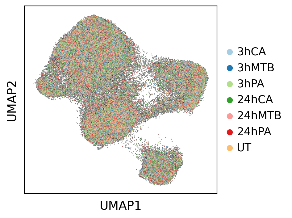
#Visualization of basal state
sc.pl.umap(adata, color='timepoint', title='', add_outline=True, palette=sns.color_palette("Paired"))
Visualize relationship of perturbations
We then use learned H to understand the general relationships of different perturbations. H is a 6 X 10 table in this case, and we can use PCA to visualize perturbation relationship in a lower dimension.
[10]:
#get H
n_prog = cellcap.module.n_prog
h = cellcap.get_h()
h = pd.DataFrame(h)
h.index = drug_names
h.columns = ['Q'+str(i) for i in range(1,(n_prog+1))]
h = h.loc[['3hCA','3hMTB','3hPA','24hCA','24hMTB','24hPA'],:]
[11]:
#PCA
pca = PCA(n_components=2)
h_pc = h.values
h_pc = pca.fit_transform(h_pc)
[12]:
sns.set_theme(style='white', font_scale=1.5)
distances = np.sqrt(h_pc[:,0]**2 + h_pc[:,1]**2)
plt.scatter(h_pc[:,0], h_pc[:,1], c=list(sns.color_palette("Paired"))[:6],
            marker='.', s=450, edgecolor='white')
plt.axhline(0, color='black', linewidth=0.5)  # Horizontal line through the origin
plt.axvline(0, color='black', linewidth=0.5)  # Vertical line through the origin

# Connect points to the origin
num_points = h_pc.shape[0]
for i in range(num_points):
    plt.plot([0, h_pc[:,0][i]], [0, h_pc[:,1][i]], 'grey', linewidth=0.75,alpha=0.25)

label_offset = 0.05  # Offset for label position
for i in range(num_points):
    plt.text(h_pc[:,0][i]- label_offset*2, h_pc[:,1][i]+ label_offset, h.index[i], fontsize=10)

plt.xlabel('PC1')
plt.ylabel('PC2')
plt.show()
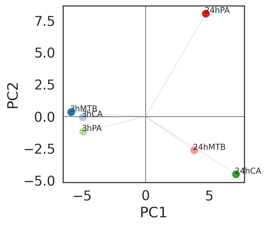
The first two principal components indicated that time points are major variation across conditions. Three pathogens have similar behavior in human monocytes at 3h time point. PA after 24 hours exposure stands out from the other two pathogens, suggensting existence of specific perturbation program.
Next, we combine A and H to reveal perturbation relationship under the context of human monocytes.
[13]:
h_attn = cellcap.get_h_attn()
df = pd.DataFrame(h_attn, index=adata.obs_names)
df["condition"] = adata.obs['timepoint'].copy()
h_attn_per_perturbation = df.groupby("condition").quantile(.90)

max_h = np.max(h_attn_per_perturbation.values)
h_attn_per_perturbation = h_attn_per_perturbation/max_h

sns.set_theme(style='white', font_scale=1)
im = plt.imshow(h_attn_per_perturbation.to_numpy(), cmap="Oranges",
                vmin=0, vmax=1)
plt.grid(False)
plt.xticks(
    ticks=range(h_attn.shape[1]),
    labels=["Q"+ str(i+1) for i in range(h_attn.shape[1])],
    #rotation=45
)
plt.yticks(
    ticks=range(len(h_attn_per_perturbation)),
    labels=h_attn_per_perturbation.index,
)
plt.title("Program usage")
plt.colorbar(im, fraction=0.025, pad=0.04)
[13]:
<matplotlib.colorbar.Colorbar at 0x7fe024217190>
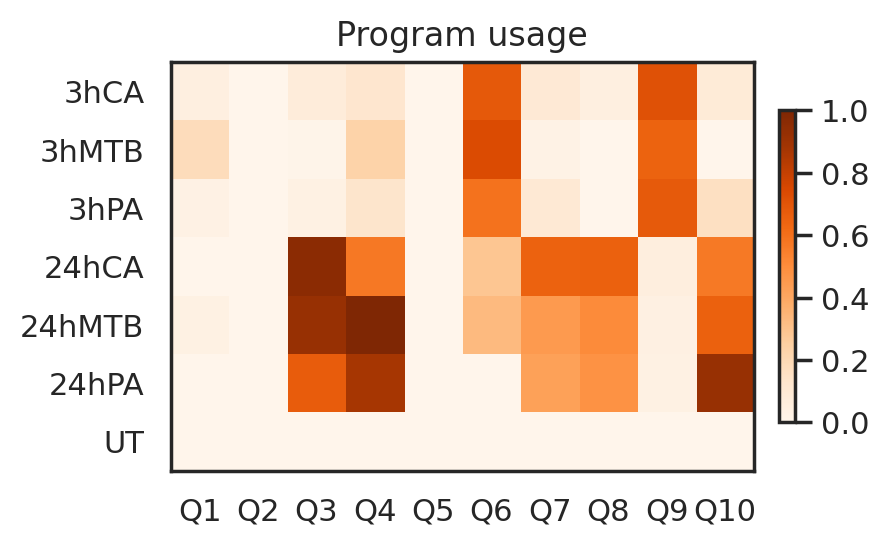
Identify perturbation program of interest
Based on the program usage heatmap, let’s focus on the Perturbation program Q6, which is enriched at 3h time point across three pathogens.
[14]:
#We use control group to scale whole data
control = adata[adata.obs['timepoint']=='UT']
X = np.asarray(control.X.todense())
scaler = StandardScaler()
X = scaler.fit(X)
adata.layers['scaled'] = scaler.transform(np.asarray(adata.X.todense()))
[15]:
#get gene loadings
prog_embedding = cellcap.get_resp_loadings()
weights = cellcap.get_loadings()

prog_loading = np.matmul(weights,prog_embedding.T)
prog_loading = pd.DataFrame(prog_loading)
prog_loading.index = adata.var.index
[16]:
#program of interest
prog_index = 6
[17]:
#get significant perturbed genes in program 6
w = identify_top_perturbed_genes(pert_loading=prog_loading,prog_index=prog_index)

Pgene = w[np.logical_and(w['Zscore']>0, w['Pval']<0.05)]
Pgene = Pgene.sort_values(by=['Pval'],ascending=True)
Pgene = Pgene.index.tolist()
[18]:
pert = adata[adata.obs['timepoint']=='3hCA']
X = np.asarray(pert.layers['scaled'])
X = pd.DataFrame(X)
X.columns = pert.var.index
X = X.loc[:,Pgene]
y = pert.obsm['X_h_scaled'][:,(prog_index-1)]
To refine identification of perturbed genes, we sort cells from high response of Q6 to low. Then, we combine linear regression and SelectKBest in sklearn to identify top perturbed genes of Q6.
[19]:
k = 10
topk = SelectKBest(f_regression, k=k).fit(X, y)

top_feature_indices = topk.get_support(indices=True)
newX = X.iloc[:,top_feature_indices]

reg = linear_model.BayesianRidge(fit_intercept=False)
reg.fit(newX, y)

gene_weights = pd.DataFrame(reg.coef_)
gene_weights.index = newX.columns
selected_genes = gene_weights[gene_weights[0]>0][0].sort_values(ascending = False).index.tolist()
[20]:
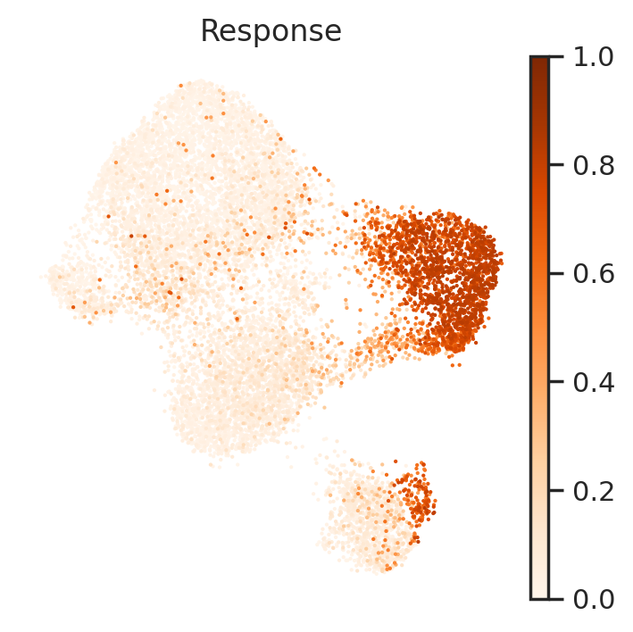
#visualize reponse amplitude of Q6 in condition 3hCA
pert.obs['Response']=np.asarray(y)
sc.pl.umap(pert, color='Response', frameon=False, cmap='Oranges', vmin=0, vmax=1)
Next, let’s visualize these identified perturbed genes via heatmap and UMAP.
[21]:
expr = X.loc[:,selected_genes]
expr['Response']=y
expr = expr.sort_values(by=['Response'],ascending=False)

x = np.asarray(expr.values[:,:-1]).squeeze()
x = gaussian_filter1d(x, 1, axis=0, mode='nearest')
sc.set_figure_params(scanpy=True, dpi=100, dpi_save=100, vector_friendly=True, figsize=(3,x.shape[1]*0.2))
sns.set_theme(style='white', font_scale=0.75)
im = plt.imshow(x.T, cmap="PiYG", vmin=-2, vmax=2,aspect='auto',interpolation='nearest')
plt.grid(False)
plt.xticks(
    []
)
plt.yticks(
    ticks=range(len(expr.columns)-1),
    labels=expr.columns.tolist()[:-1],
)
plt.colorbar(im, fraction=0.05, pad=0.04)
[21]:
<matplotlib.colorbar.Colorbar at 0x7fe02433a550>
[23]:
sc.set_figure_params(scanpy=True, dpi=100, dpi_save=100, vector_friendly=True, figsize=(1,1),fontsize=5)
sc.pl.umap(pert, color=selected_genes, ncols=5, frameon=False, cmap='PiYG',layer='scaled', vmin=-2, vmax=2,size=1)
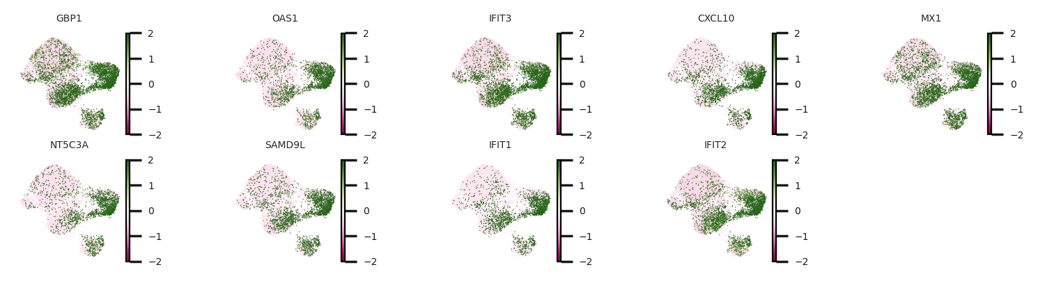
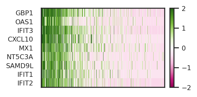
CellCap identified a subpopulation of monocytes has higher response to CA at 3h time point. Meanwhile, we identified perturbed genes of Q6, including IFIT1, IFIT2, and IFIT3. Experssion patterns of these perturbed genes also greatly agree with the response pattern.
Uncover the corresponded basal state
following up program Q6, we next aim to cellular identity that explains the response amplitude of Q6. Different from identifying perturbed genes of Q6, we will use basal state of to retrieve a basal program relevant to perturbation program Q6. To do so, we calculate cosine similarity of perturbation key of CA at 3h time point to basal states of all untreated cells. We then sort cells from high cosine similarity to low. Next, we combine linear regression and SelectKBest in sklearn to identify
top basal genes that explain cellular identity of this subpopulation of monocytes.
[24]:
#get perturatbion key
H_key = cellcap.get_H_key()
[25]:
X = adata[adata.obs['timepoint']=='UT'].layers['scaled']
X = pd.DataFrame(X)
X.columns = adata.var.index

head_index = 1
y = cosine_distance(control.obsm['X_basal'],H_key[drug_names.index('3hCA'),(prog_index-1),:,head_index])
[26]:
reg = linear_model.BayesianRidge(fit_intercept=False)
reg.fit(X, y)

gene_weights = pd.DataFrame(reg.coef_)
gene_weights.index = X.columns
Bgene=gene_weights[gene_weights[0]>0][0].sort_values(ascending = False).index.tolist()

k = 10 # 50
topk = SelectKBest(f_regression, k=k).fit(X.loc[:,Bgene], y)
top_feature_indices = topk.get_support(indices=True)
selected_basal = topk.get_feature_names_out().tolist()
[27]:
#visualize relevance to Q6 in condition untreated group
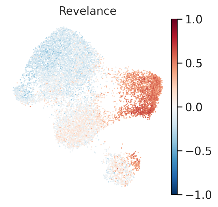
control.obs['Revelance']=np.array(y)
sc.set_figure_params(scanpy=True, dpi=100, dpi_save=100,vector_friendly=True)
sc.pl.umap(control, color='Revelance', frameon=False, cmap='RdBu_r', vmin=-1, vmax=1)
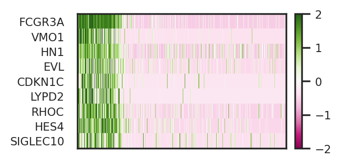
Now let’s visualize these identified basal genes via heatmap and UMAP.
[28]:
expr = X.loc[:,selected_basal]
expr = expr.iloc[:,:-1]
expr['Relevance']=y
expr = expr.sort_values(by=['Relevance'],ascending=False)

x = np.asarray(expr.values[:,:-1]).squeeze()
x = gaussian_filter1d(x, 1, axis=0, mode='nearest')
sc.set_figure_params(scanpy=True, dpi=100, dpi_save=100, vector_friendly=True, figsize=(3,x.shape[1]*0.2))
sns.set_theme(style='white', font_scale=0.75)
im = plt.imshow(x.T, cmap="PiYG", vmin=-2, vmax=2,aspect='auto',interpolation='nearest')
plt.grid(False)
plt.xticks(
    []
)
plt.yticks(
    ticks=range(len(expr.columns)-1),
    labels=expr.columns.tolist()[:-1],
)
plt.colorbar(im, fraction=0.05, pad=0.04)
[28]:
<matplotlib.colorbar.Colorbar at 0x7fdff80fdb50>
[29]:
sc.set_figure_params(scanpy=True, dpi=100, dpi_save=100, vector_friendly=True, figsize=(1,1),fontsize=5)
sc.pl.umap(control, color=selected_basal,ncols=5, frameon=False, cmap='PiYG',layer='scaled',
           vmin=-2, vmax=2, size=1)
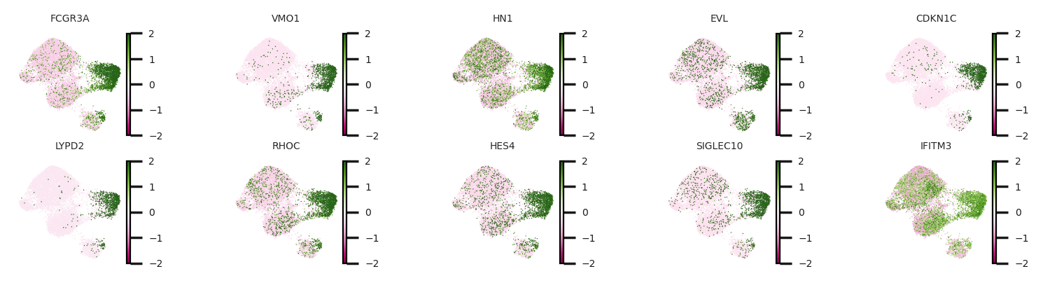
To briefly summarize results above, we identified two gene sets, perturbed genes of Q6 and basal genes relevant to Q6. Here, we want to emphasize the correspondence between basal genes relevant to Q6 and the perturbed genes of Q6. Basal genes should be interpreted as markers for cellular identity of this subpopulation of monocytes, while perturbed genes serve to reveal a perturbation response of this subpopulation to pathogen CA.